It shouldn't take 50,000 buttons to format a bulleted list
Software UX has been built around make it easy to do things. It's shifting towards make it easy to say what you want.
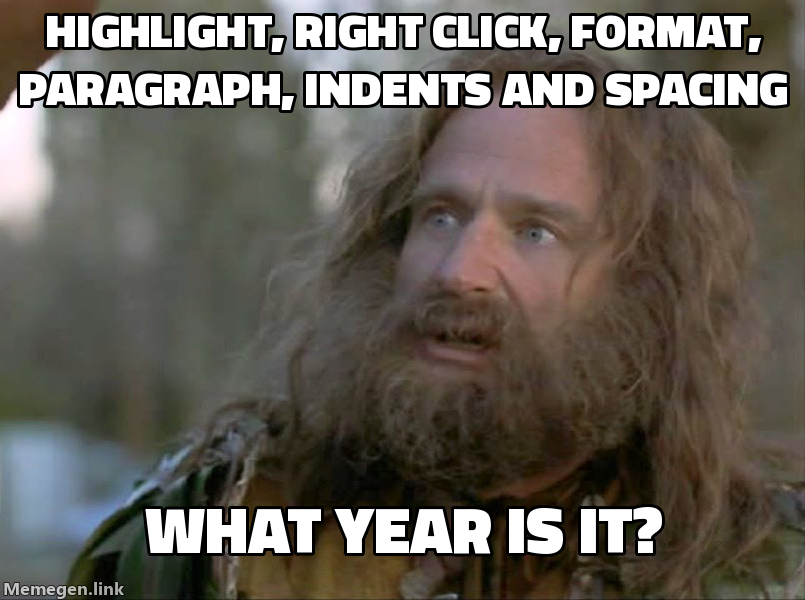
Anytime I have to open a document editor these days, I feel like a caveman. Why are there 50,000 buttons at the top? Why do I need to highlight, right click, and select three other options anytime I need to do anything beyond the basics? Why does it feel like a battle to get a bulleted list to format correctly?
When I open a Word document, I have a simple goal. Why can’t I just tell it that and it does the thing?
Up until now, software UX has been built around make it easy to do things as the user. I think it’s shifting towards something different.
Make it easy to communicate your goal. For most people, the goal should be the interface.
Hand off everything that used to live in the UX to AI. This is one of the reasons horizontal SaaS stocks have been taking a dive. The main user story is becoming: I’m a user, I want to do a thing. Do the thing.
You don’t need a toolbar with 50,000 buttons. You don’t need to surface every edge case and put it in front of the user.
What we have today is tomorrow’s power user UX. Software built for an AI-first world will look like: tell me your goal, I’ll do the rest.
UX isn’t going away. There will be power users who want fine-grained control. But most people just want their bulleted list to work on the first pass. AI is smart enough to do that now.